Anyway, after a fun Friday night at Alex's house playing with Apple's default time-wasting app, Photo Booth, a number of the results were uploaded to Facebook—one of which caught my attention, thinking to myself it looked like some old book art (especially with Alex's facial expression and pose). Thus this:

The obvious inspiration being the classic Hardy Boys mystery novel covers, with the light blue band across the top.
Still wanting to give it my own sort of flair, I decided a full-fledged logo was needed. That took me a bit to knock out, but I think it has a nice retro look to it. For the secondary text I was able to figure out a typeface that looked mostly like the one used on the original Hardy Boys books (I'm actually pretty sure it's the very same).
(More, after the jump.)
After filling in the upper portion of the image, and giving it a more painterly look, I ended up trying to apply Photoshop's halftone pattern to give it an "I just found this old book and scanned it in" look. Sadly, Photoshop doesn't allow for the scale of the pattern to go very low, so I had to blow the image up to 800% in size, apply the filter(s) as needed, and then shrink it back down. I really like the subtle, printed look it gave to it.
(On a side note, the enlarged version actually came out looking cool on it's own, and I may print it up as a small poster or something.)
Anyway, after hunting down suitable, old paperback textures, then slightly offsetting the different layers of CMYK to give it that low-quality printed feel, and adding worn edging and dirtiness at the top, I think it looks pretty legitimate.
Yet that wasn't enough for me. I felt this needed to be fleshed out a little more; made a bit more real. Of course this old novel has to have a back cover with a synopsis!

…Which explains why the character in the lower right of the front cover is so much more pale than the others.
This one was a bit harder to pull off, trying to give that smooth, plastic-y texture of the card-stock cover, from an image of a regular, inner page was no easy feat. In fact, after finally getting it to my liking, I initially panicked upon realizing I'd have to try working in a bar code under that wrinkled lower-left corner, only to give a sigh of relief, realizing that bar codes wouldn't have come along until years later.
All that was left was to ofset the CMYK here, after filling in the synopsis in the best 1950s-'60s jargon and writing style I could muster, which seems to've worked like gangbusters.
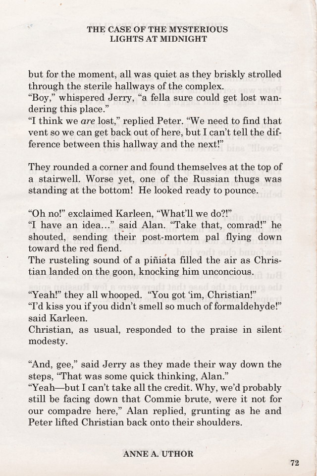
Finally, a sample page I "scanned", complete with slight transparency, the text from the opposite page barely showing through (which, although not legible on this side of the page, is a completely distinct body of text in its own right).

Zounds!

I would never, in any moment of my life, have the patience to do anything like this, and care enough to make it all so real-looking. You have my admiration, Parky.
ReplyDeleteAwesome, kid. There HAS to be some job out there for you to make this kind of shit.
ReplyDeleteYour innate way of capturing every detail is beautiful. Like Kayla said, your patience is great my friend. The time and care that you've put into this makes it the incredible work of art it is.
ReplyDeleteVery nice, my friend, but did you intentionally or unintentionally misspell "locale" on the back cover?
ReplyDeleteThank you all thus far for the kind words and encouragement!
ReplyDeleteAnd yes, Alex, that was an unintentional typo. It has now been corrected.